The King’s Fund Website Redesign
The King's Fund needed a website redesign that would prioritize income generation while remaining accessible to health and social care professionals. We delivered a distinctive, user-centered design with improved navigation, search functionality, and a flexible design system that resulted in a successful pilot launch.
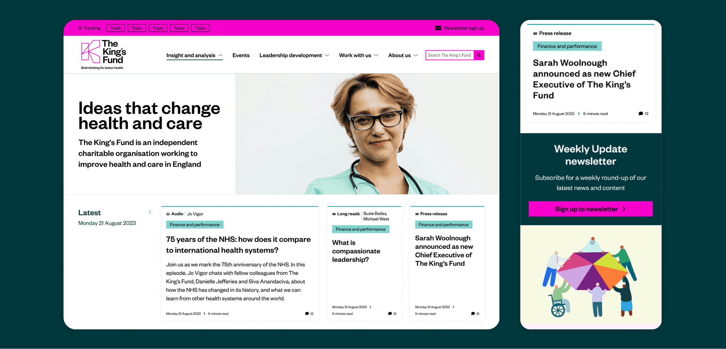
The King’s Fund’s previous website struggled to balance income generation with accessibility for professionals in the health and social care sector. Navigation and search issues made it difficult for users to find relevant content, limiting engagement and revenue potential.
Outcome
The redesign delivered a flexible, user-friendly platform that supports revenue streams through events and partnerships while improving navigation, search functionality, and a flexible design system.
Created a visually distinct website that stands out from competitors
Developed two themed sections with flexible, dynamic content modules
Established a comprehensive design system supporting future growth
Implemented enhanced search and filtering capabilities
Challenge
Designing a website that stands out from the competition
Building stronger relationships with users throughout their careers
Remain accessible to professionals across all career stages. Move away from one-way communication to a more collaborative approach.
Improves discoverability of relevant content
Surfacing the right content at the right time to maximise impact.
Supports future growth with a flexible design system
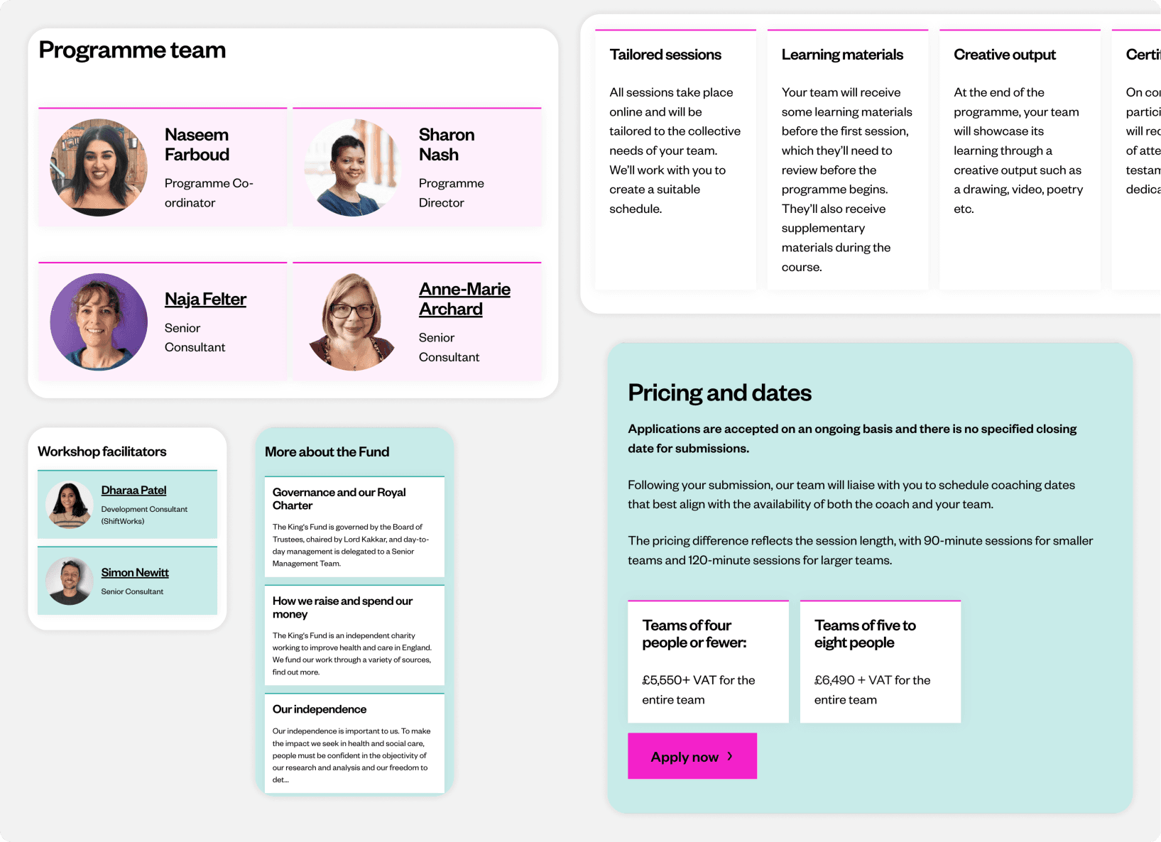
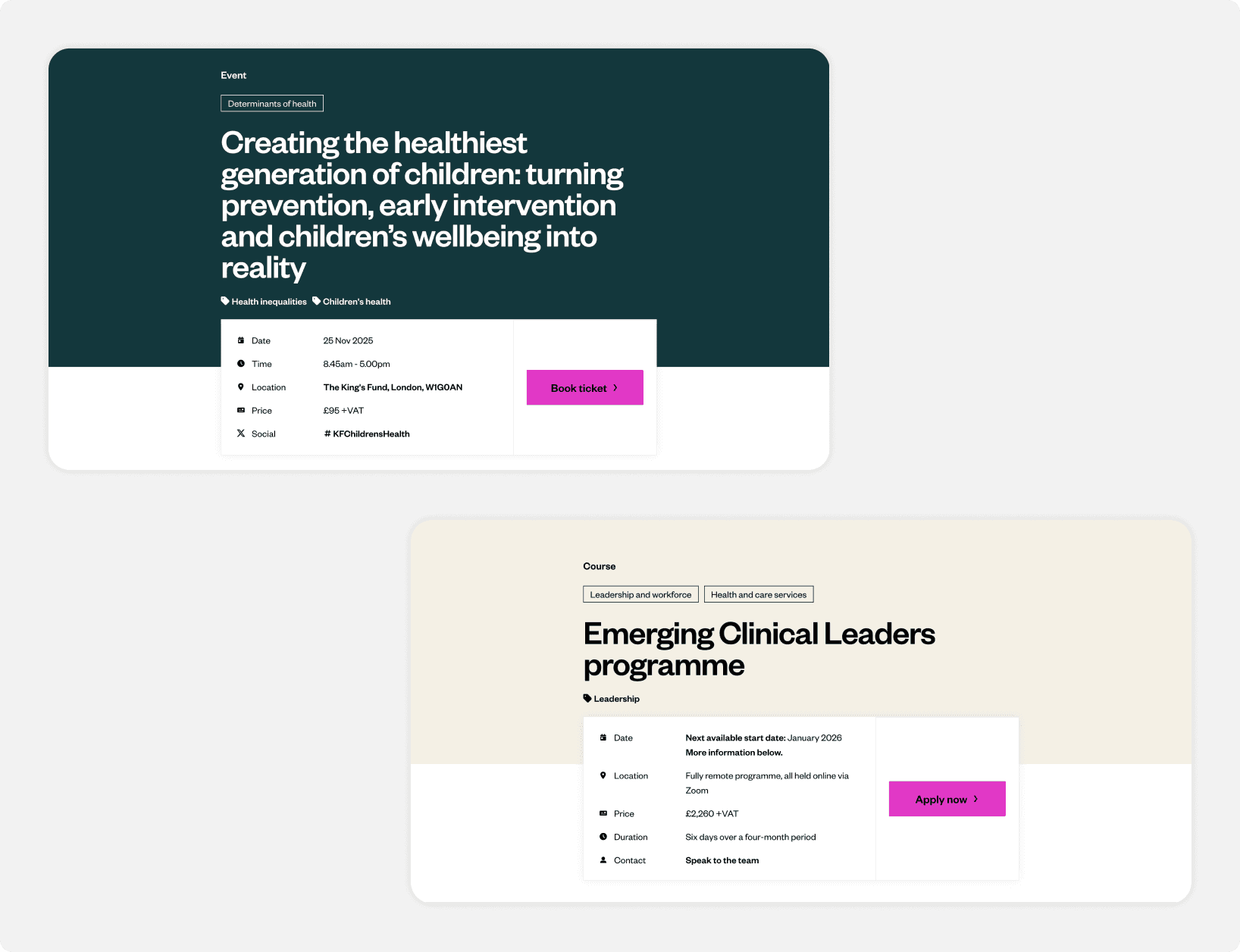
Generate income through events, courses, partnerships, and sponsored content.
Design
Visually stand out from competitors
Moved away from the previous purple colour scheme (which was too similar to competitors) to create a distinctive but friendly visual feel.
Workshop to define the core idea
design
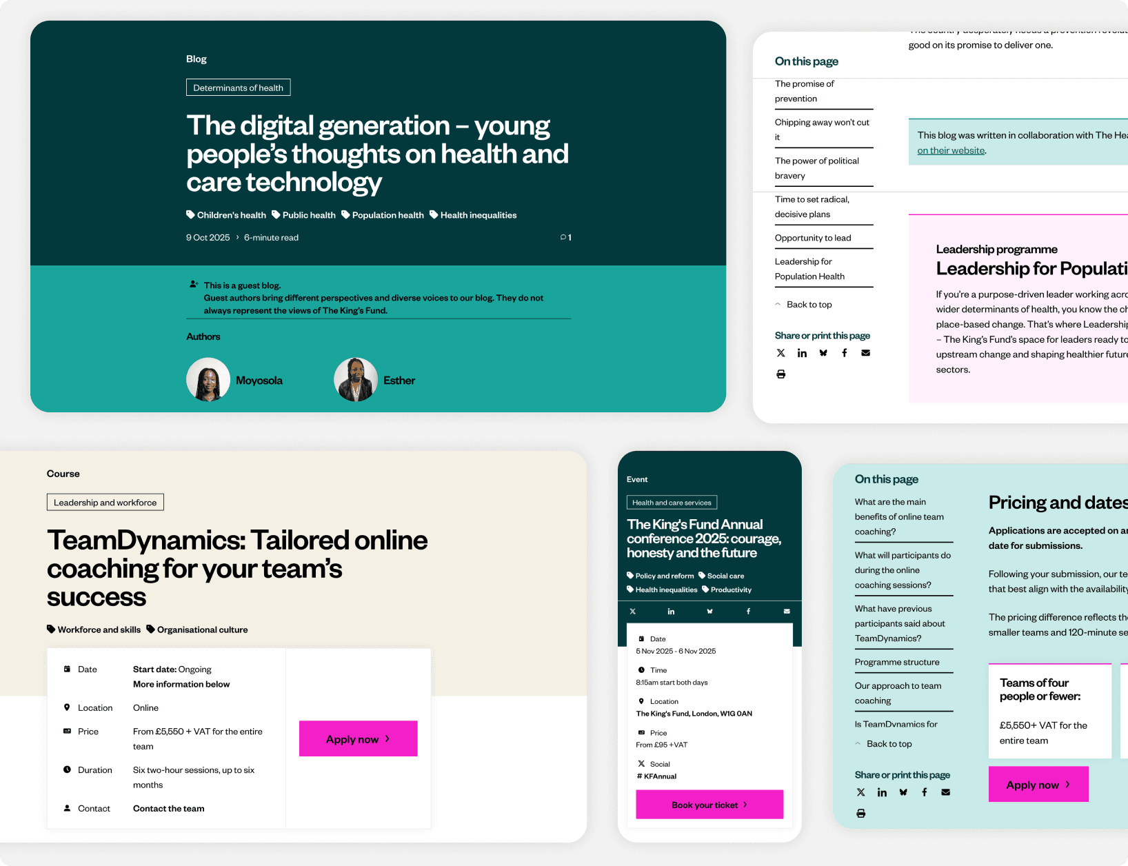
Flexible design system
Developed a flexible design system supporting diverse content needs and future growth.
Created flexible components adaptable to different content types and future expansion.
Each section received its own visual and structural logic to aid orientation and reinforce purpose.
design
Improved discoverability of content
Delivered an intuitive user experience with clear navigation and page layout
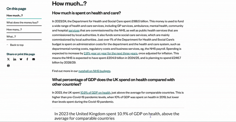
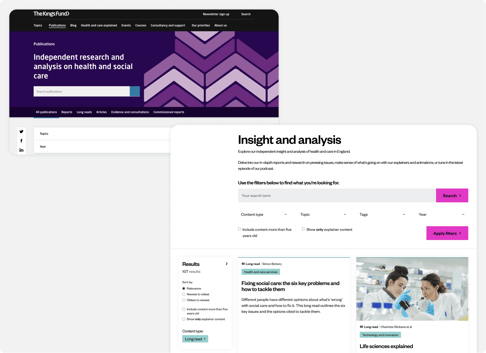
Redesigned the site architecture to improve content discoverability, using tags and topics as categorise content
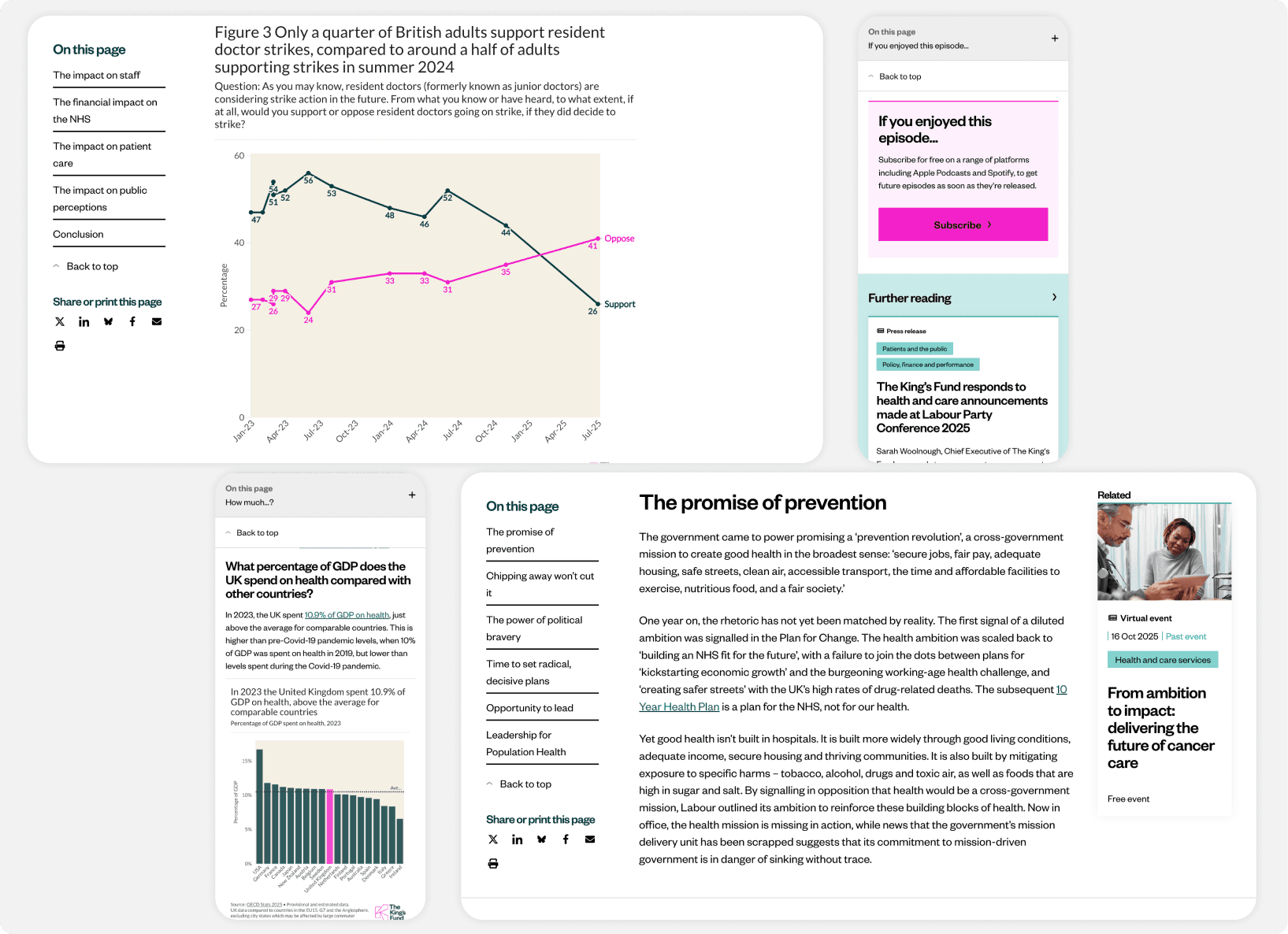
Introduced a table on content module for quick navigation inside the page
Introduced structured page template for long and text heavy pages (eg. articles and reports) templates so users can immediately identify where they are and what the key takeaways are
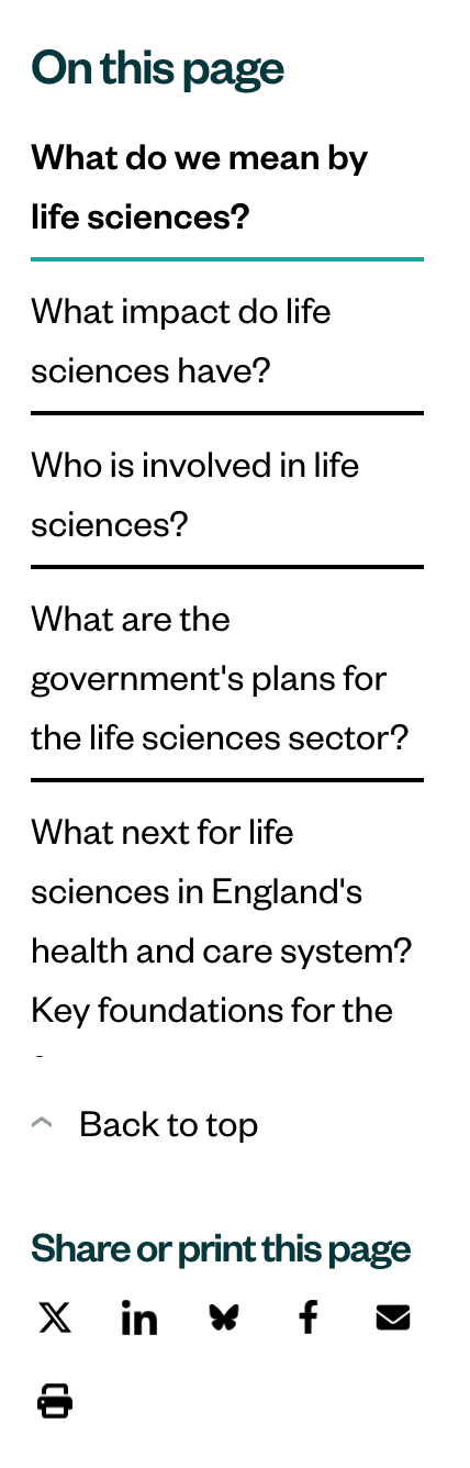
Mobile table of content for easy navigation on the page.
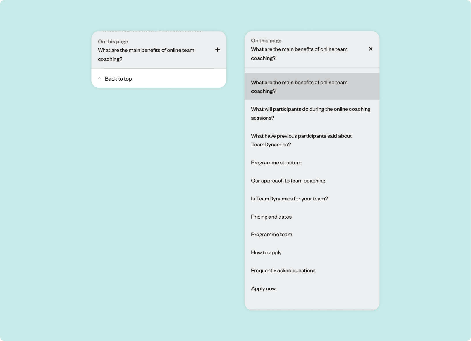
Mobile table of content for easy navigation on the page.
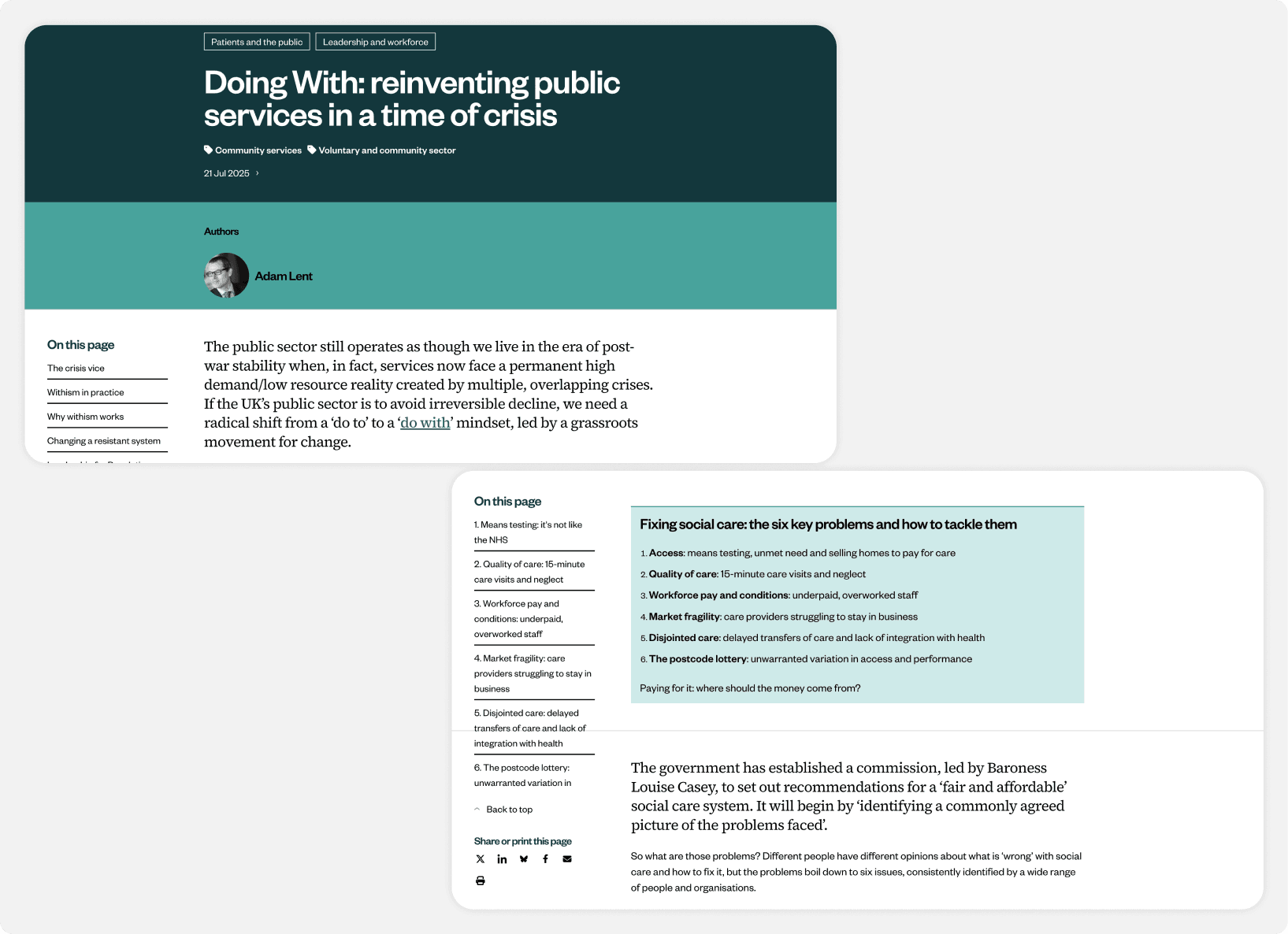
Summary at the beginning of long reads.
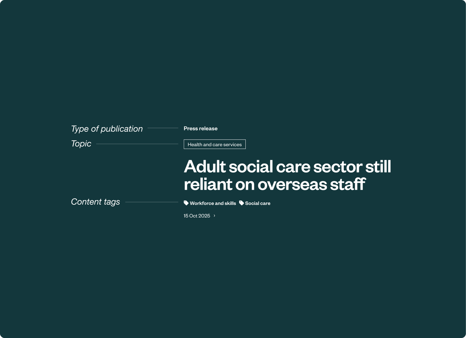
Categorisation to easily find similar content.
design
Improved search and filtering functionality
Redesigned to prioritise usability, with enhanced filtering and contextual surfacing of related content.
Enhanced filtering capabilities to help users find relevant content
Filtering before and after.
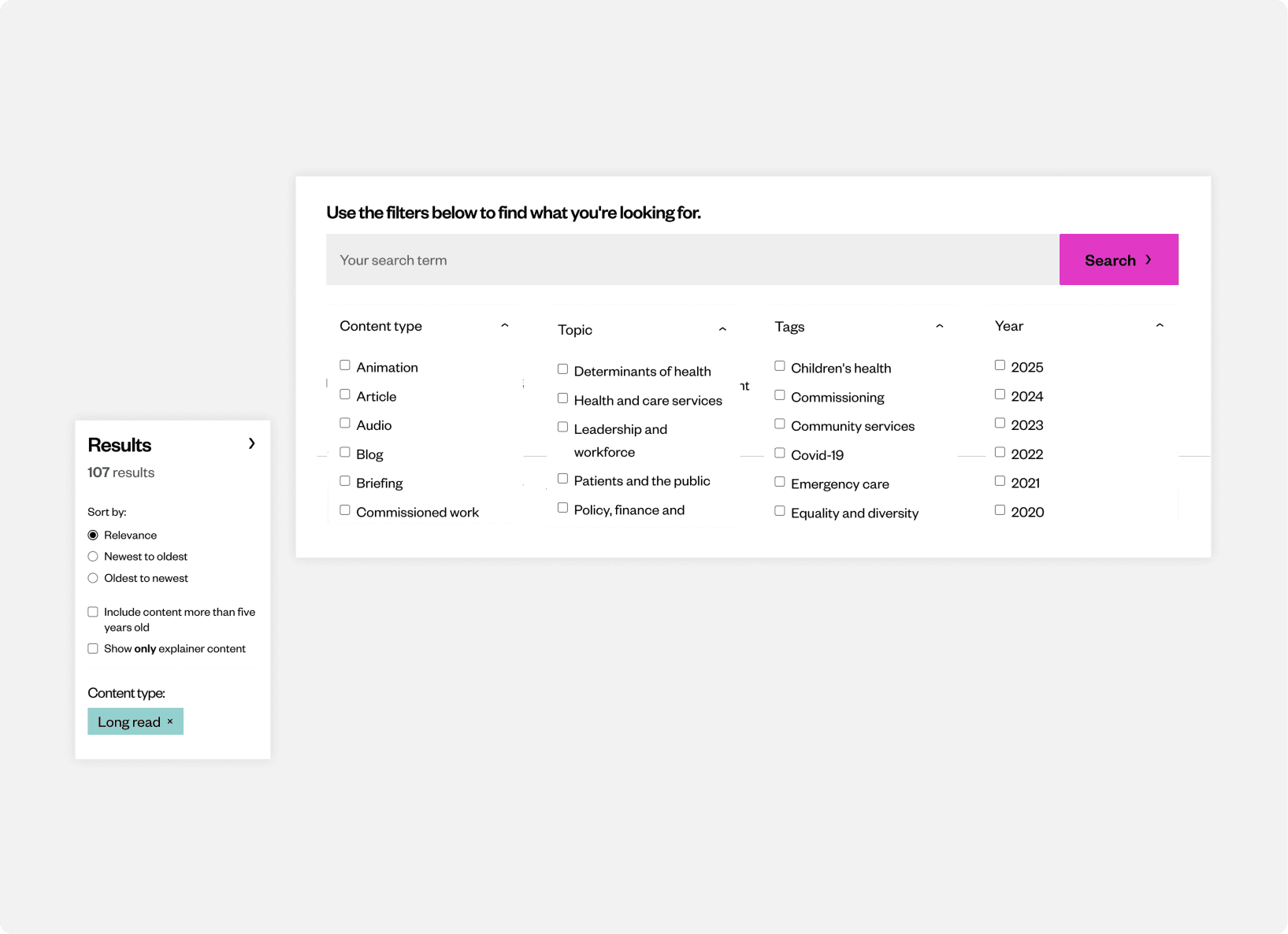
Filter results by four filters: content type, topics, tags and publishing year. Sort results by recency.
Design
Foundation for financial growth
Prioritised income generation through events, leadership courses, corporate partnerships, and sponsored content.
Design
Closer relationship with users
Ensured accessibility for both experienced professionals and those new to the health and social sector: type of topics and events provided
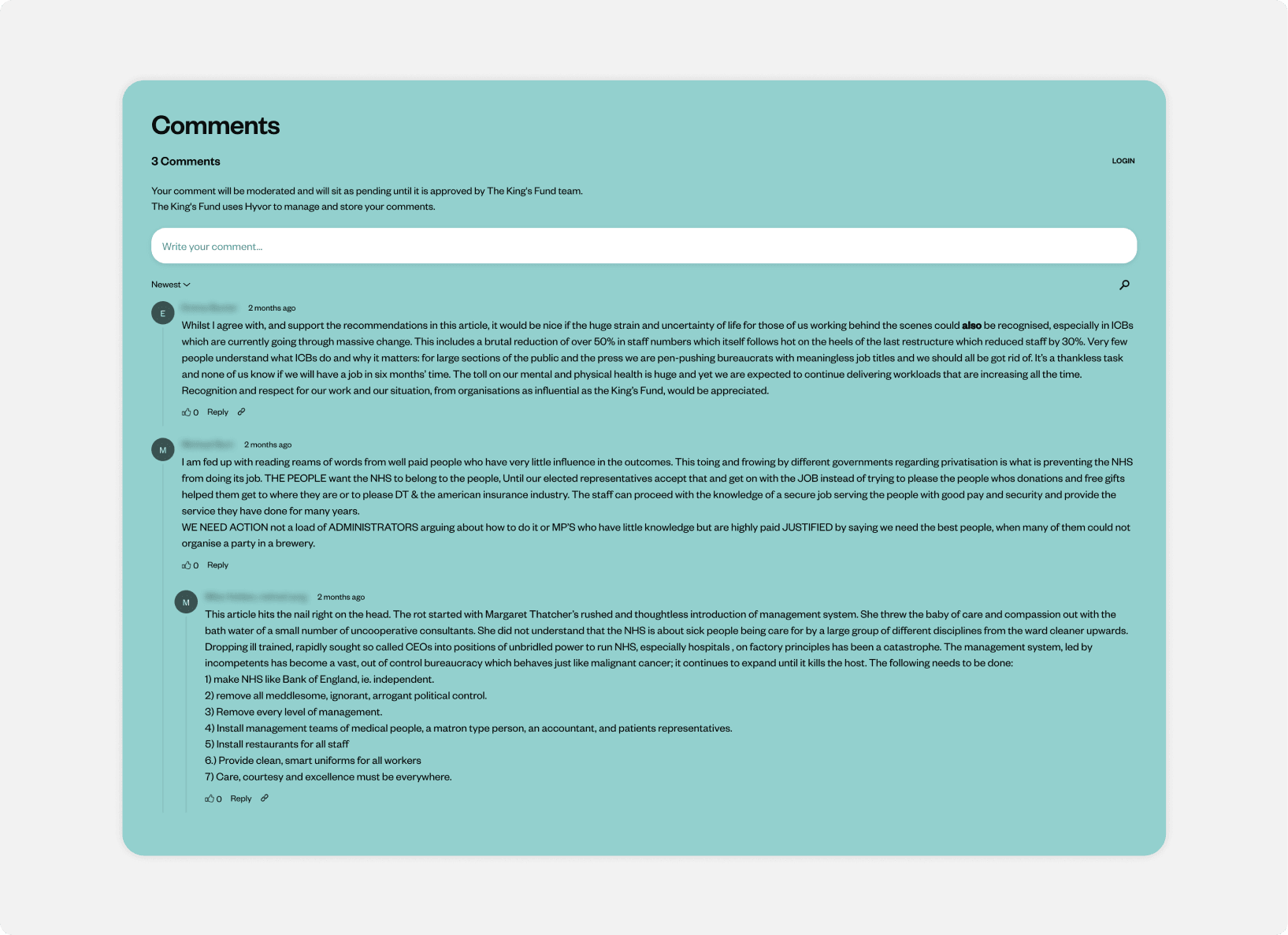
Adopted a more collaborative tone, reducing one-way communication and inviting interaction with comments.
Impact
‘A fresher, more modern look’ which aligns digital presence with the new strategic direction.
The refresh strengthens the organisation’s digital credibility. For a think-tank organisation in the health & social care space, having a modern, intuitive website bolsters its authority, helps in attracting engagement, research partners, events, and new audiences.
Other projects
Let's connect
floraharai@gmail.com
© 2026 Flora Harai